
Painting River Rocks | Watercolor Walkthrough 1

Here’s the finished piece! 11x8 on Arches cotton cold press 140 lb | I took some liberties in exaggerating the color and hue range, as well as added a few leaves for good measure.
Welcome to the first of my Watercolor Walkthrough series!
I will be showing you work in progress photos, what ran through my head as I decided on colors, and some focused bits on specifically how to achieve a wet and half submerged effect.
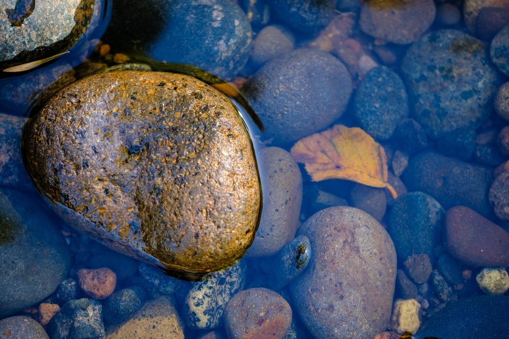
This is a based on a lovely photograph of pebbles and rocks underwater by Ernesto Andrade from Unsplash (a lovely photo site hosting only free to use images)
P.S: doesn’t the main yellow rock look like an everything bagel? especially in the photo! haha
Observation and palette decisions
My first observation is that this is a very blue heavy photo. To keep the painting unified yet still show contrast I decided that I would overemphasize how varied the shades of blue are. This means making cool blues cooler, warm blues warmer, such as by bringing in vibrant greens if I see some hints of turquoise so the piece doesn’t just look like a wash of blue.
Next, what drew me to the photo was the contrast that center yellow rock and the leaf provided. I also see some rusty red rocks too. I decided to add more leaves so the eye jumped around the page more, I also decided to simplify all of the earth and warm tones to simply medium yellow, gold, or rust, and minimized how much brown was on the main rock.
Lastly, for neutrals/darks I decided to lean into the violets, this meshes with blue but doesn’t effect the yellows like green or red would; I chose a violet leaning warm brown (Caput Mortuum, PR101) for darks, Cobalt Violet for neutral texture and to bridge between venetian red and ultramarine blue.
French Ultramarine (PB29 by Winsor&Newton)
Pthalo Blue, Green shade (PB15:3 by Daniel Smith. Star of this painting! transparent, and highly, highly staining)
Pthalo Green (PG7 by M Graham, a cool sea green to stay away from any grassy tones)
Naples yellow deep (PBr24 by Sennelier, this is a golden warm yolky yellow version of an ochre or raw sienna, used here because being an earth it goes muted instead of green when hitting the many blues I will be using!)
Hansa Yellow Medium (PY 97 by Daniel Smith)
New Gamboge (PY 97 + PY110 by Daniel Smith)
Venetian Red (PR101 by Sennelier, a rich rust red brown, Chosen to neutralize the blues as well as provide a base for some of the red stones, a burnt sienna or Quinacridone orange would probably serve just as well)
Cobalt Violet (PV14 by Winsor&Newton, a bright pink leaning violet that is highly granulating, cobalts have an interesting rock-like speckled texture to them as their granulation pattern, I thought this would be a fun way to add a slight surrealness to the piece and add visual interest.)
Caput Mortuum (PR101 by Sennelier, also known as Mars violet, it’s the same pigment as indian/venetian red but treated to be darker, it’s a chocolatey purpley warm brown, )


Base wash, setting the main tones and the beginnings of values
As you may see, some of these rocks are already fully rendered out, this is because this painting predates this blog! so ignore those for now, I want you to look at the base wash, the rocks with only a single wash on which you can still see the pencil lines. This is done with a wet-in-wet technique while the paper is still soaked through from me stretching it. Essentially, I pick a few colors, make sure the paint is diluted a bit, drop them onto the page, and let the colors intermingle as they will..
(For those who do not stretch, you can also achieve this by wetting the paper very generously if you use a watercolor block or use a heavier weight paper, I just do both together because it saves some waiting time)

Step 3 - Add main washes for more detailed rocks, carve out each rock’s shadow
I started adding texture to the bigger rocks, following my plan to exaggerate color variation while staying within the blue family. Something fun I discovered: cobalt violet and Venetian Red makes some very interesting mauves thanks to Venetian Red’s orangeness muting the mix! The base wash has already set the tone, I am just rendering out details, I am trying to stay bold in every stroke to preserve the natural granulation of the pigment. It’s not very necessary to achieve 1 to 1 likeness here, the darkest darks are mixed from caput mortuum and ultramarine or phthalo blue, once each stone has an outline, the image has more depth and it’s a lot easier to get experimental with colors, I particularly loved adding the bright violet!

Bonus: partially submerged rocks, wet stains and ripples
Ripples: Notice the yellow of the rock reflecting onto the water, this yellow shadow stains everything in its path darker and warmer. I made a wash with hansa med yellow and used the same technique as I did elsewhere for the rocks, just using red and brown instead of deep blue and a heavier hand. Another thing is the harsh transition of bright ripples to darkest darks, you want hard edges here for contrast.
Wet Rocks: Water essentially works as a temporary gloss varnish. tones are much more saturated because the smooth surface can easily reflect colors that were previously scattered by the rock’s matte rough texture. The secret is that the lights that DO occur has a sharper glossier edge!

Ripples, specks, final details
The final layer, I do some color correction, add the shadow of ripples, speckled dots on the rocks, lift/smudge spots that are too dark, etc. The little things!
Anywho, I will attach the final piece right below here once more. This is, of course, just my personal style of painting, so not a hard and fast tutorial with strict rules. My main hope is to explain the stylistic/artistic choices I made rather than to dictate how things should be done. So, I hope this was still helpful or interesting to you in some manner, and would love to hear what choices you make for your art!
Thanks for reading!
